
Reports
Hub for Apphud's chart reports — group index, availability, data freshness, filter and segment reference, and attribution mappings.
Reports is Apphud's collection of 30+ interactive chart reports for analyzing subscription metrics. Each report shows a data table, a relevant chart, and the ability to slice by segments, filters, and time buckets.
For mechanics (date pickers, filters UI, segment dropdowns, share/export), see Common controls.
For cross-surface analytics concepts (VAT, charge date, First Seen Date, cohort caveats), see About Analytics.
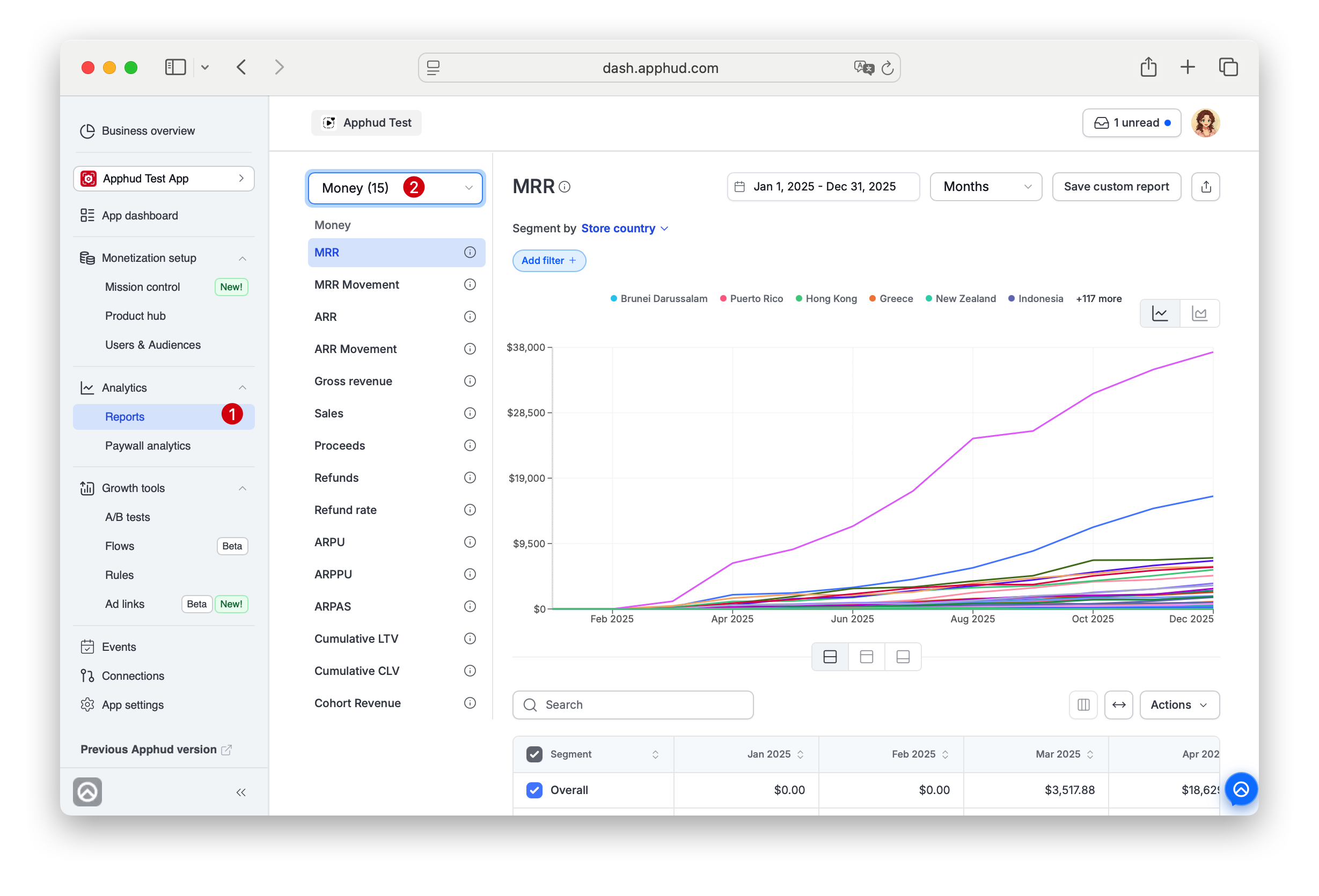
Reports groups
In the app sidebar, reports are organized into groups, accessible via the group dropdown at the top of the Reports view:
| Group / Hub page | What's inside |
|---|---|
| Money | Revenue-side metrics — MRR, ARR, Sales, Proceeds, Refunds, ARPU family, Cohort Revenue |
| Advanced Reports | Heavy operational tables — Renewals Performance, Free Trials Performance, Refund Requests, Average Revenues |
| Subscriptions | State-of-subscriptions — Churn, Churned Revenue, Active Paid, Active Trials |
| Cohorts | Cohort retention by renewal period (the hub doubles as the concept page) |
| Users | User-side — New users, Active Users |
| Conversions | Funnel conversions — Trial, Regular subs, Paid intro, Promo, Non-renewing, Flows |
| Events | Time-series of event counts |
The All view in the dropdown shows every chart in one flat list. Saved reports appear in their own sidebar section.
Availability
Some reports are available to all Apphud users; others require paid plans.
Available on all plans:
- MRR
- Gross revenue
- Sales
- Proceeds
- Refunds
- Active Paid Subscriptions
- Active Trials
- New users
- Events Report
All other reports require Pro plan or above. Refund Requests Report additionally requires the Win Back Refunds add-on.
Data freshness
| Chart family | Update delay |
|---|---|
| Revenue charts (Sales, Proceeds, Refunds, Refund rate), MRR / ARR, MRR / ARR Movement, Cohort Revenue, Active Paid Subscriptions, Active Trials | Under 15 minutes |
| Other charts (ARPU, ARPPU, ARPAS, LTV, CLV, Conversions Charts, Events Chart, etc.) | Within 1 hour |
| Cohort retention (Subscribers retention, Revenue retention) | Within 1 hour |
| Predictions | Daily at 00:00 UTC |
Between 00:00 and 06:00 UTC you may see temporary processing delays. For cohort caveats and the "don't analyze today's cohort" rule, see About Analytics → Near-real-time.
Chart controls
The chart controls below are specific to chart reports. For controls shared with other Analytics surfaces (date range, filter mechanics), see Common controls.
Reports sidebar
The left sidebar groups every chart report into categories. The group dropdown at the top shows the current count per group. You can filter the report list to show only reports of a certain group.
Hover the ⓘ icon next to any report name in the sidebar to see a short description in a tooltip — useful for picking the right report without leaving the current one - alone with "Learn more" link leading to the detailed description.
Saved reports appear separatelyReports you've saved via Save custom report appear in a Saved reports section, separate from the built-in group dropdown.
Infobox and Learn more
The same ⓘ icon is shown next to the chart title - it opens a short description of the metric in a tooltip. Some descriptions include a Learn more button — clicking it opens the chart's full doc in a new tab.
Granularity
You can zoom in or out when analyzing data in a report. The granularity dropdown next to the date range controls the time bucket on the x-axis: Days, Weeks, or Months. Switching granularity recalculates the chart and the underlying table.
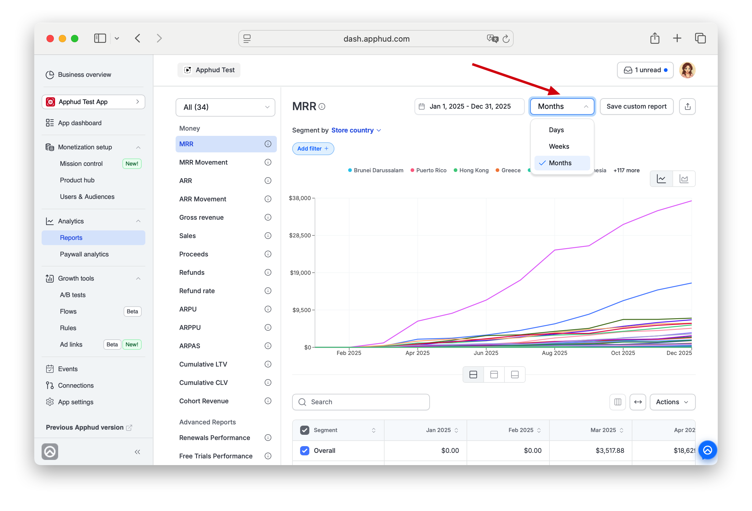
The default granularity depends on the selected period:
- Up to 4 weeks → grouped by day.
- 1–3 months → grouped by week.
- More than 3 months → grouped by month.
190-point limit for reportsCharts support up to 190 data points regardless of granularity. If your configuration would exceed this (e.g., "by day" for 200+ days), you'll see a message "Too many points" prompting you to revise the chart settings and change granularity or chosen period.
Exceptions: Cumulative LTV and Cumulative CLV charts.
Apps filter
The Apps button opens a multi-select of your apps. So you can analyze a metric you are interested in for several apps at the same time.
Segment by
The Segment by dropdown adds breakdown lines (or stacked areas) for each value of a dimension.
- Pick one dimension (e.g., Ad network) to split the chart into one series per value.
- Pick a second dimension to nest segments — for example, Store country nested by Product shows one segment per combination. Almost every chart report supports nesting two dimensions.
To change the set nesting - just choose a different combination of segments in the desired order - the first chosen one will be shown on top.
For the canonical list of segment and filter dimensions (and which charts support each), see Filters and segments below.
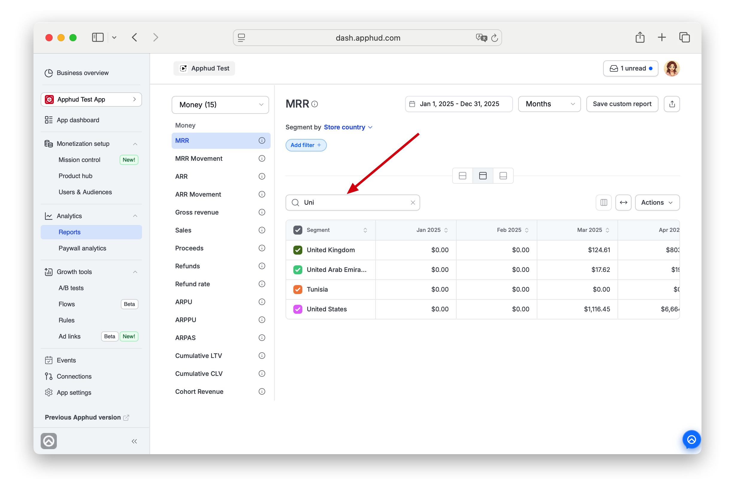
Search
When the table is shown, the search field above it filters table rows by segment name or value — a local text filter. Typing Unit leaves United States, United Kingdom, United Arab Emirates.
Search filters both chart and table data.
Segment selection
You can check/uncheck segments (rows) in the table to filter the chart. If you have nested segments, the check will leave only items corresponding to the higher nested level that is chosen.
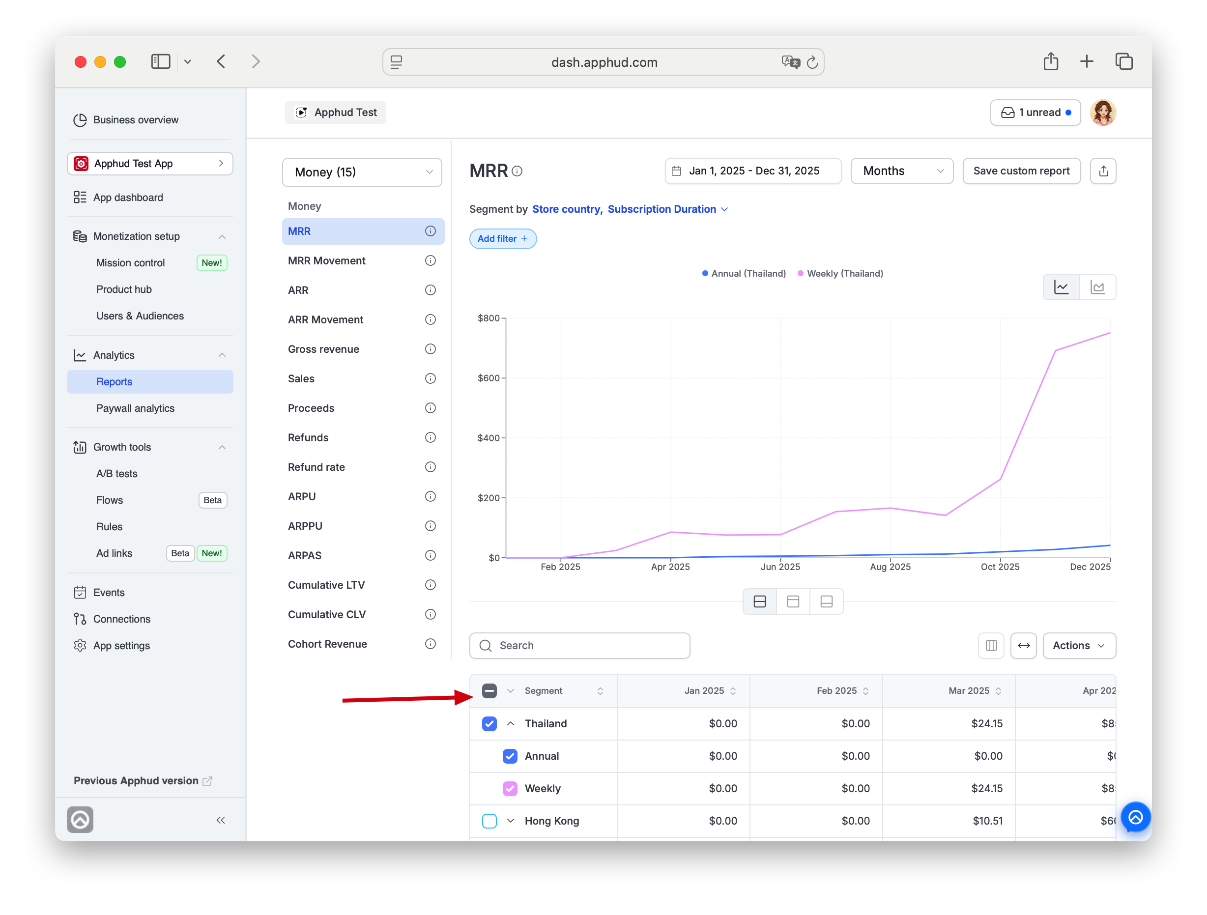
Chart type
The chart-type toggle (icons above the right edge of the chart) switches between visualisations — typically line and stacked area, sometimes bar. Available types depend on the report and the segmentation chosen.
Display toggle (chart / table / both)
The three-button widget under the chart switches the layout:
- Chart + Table (default) — chart on top, table below.
- Table only — hide the chart, show only the data table.
- Chart only — hide the table.
The selection sticks until you change it.
Save custom report
Click Save custom report in the top-right to save the current view — period, granularity, segments, filters, chart type, and table state.
A dialog appears:
- Report name (required).
- Description (optional, up to 250 characters) — only stored when you fill it in.
Saved reports appear under Saved reports in the left sidebar with the name you chose. The description is shown as a tooltip on the ⓘ icon next to the saved-report name (default reports always have a built-in description; saved reports only when you provided one). More info on saved reports can be found here.
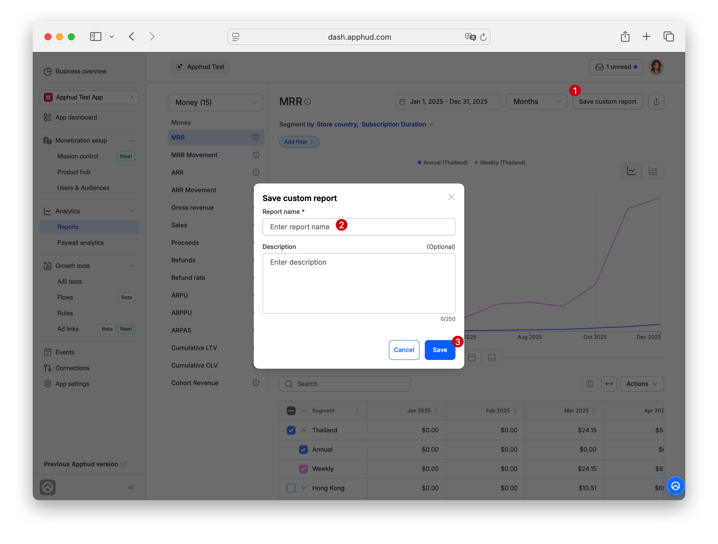
Table controls
These apply to the table view of a report (and to Paywall analytics tables).
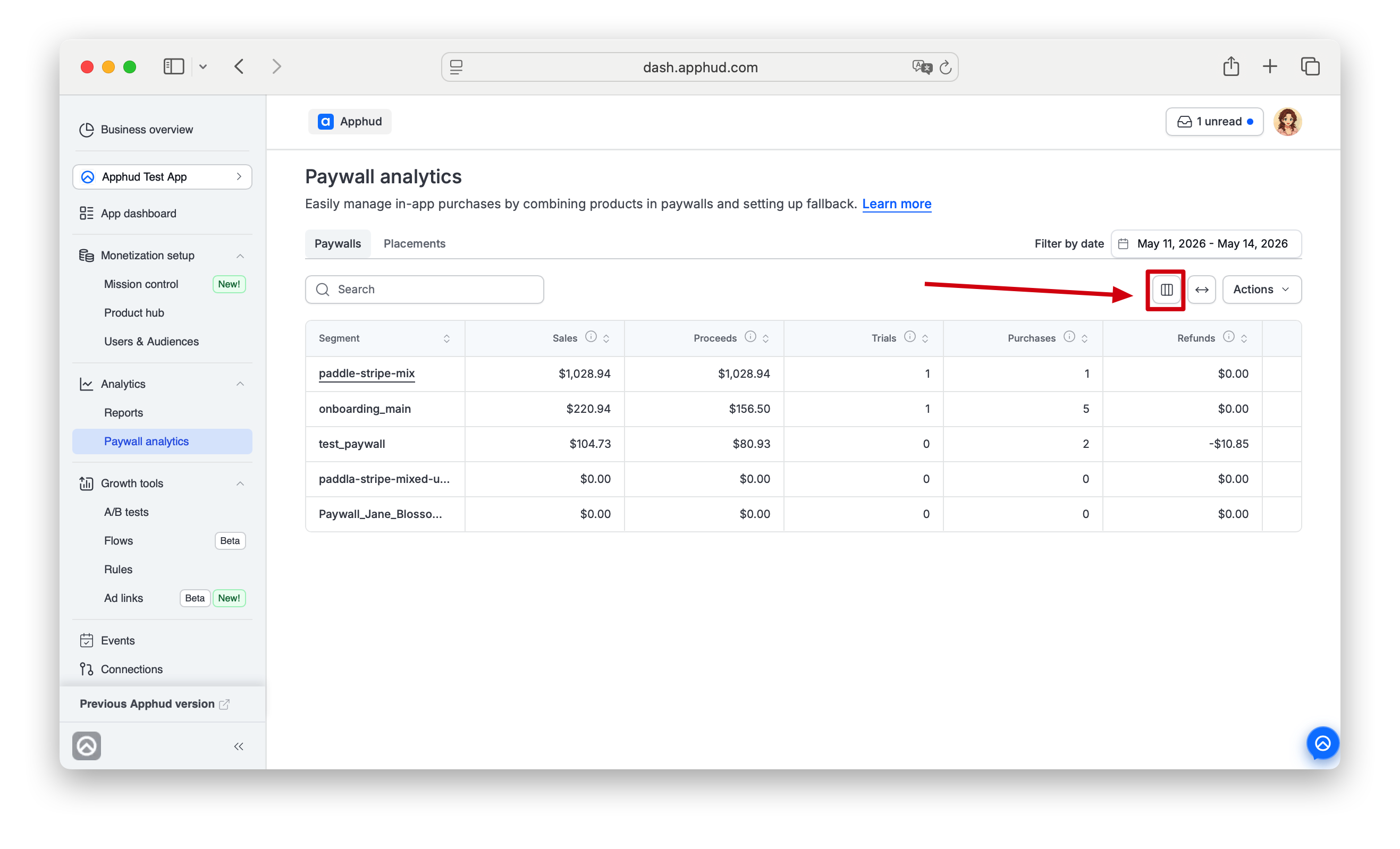
Edit columns
The Edit columns panel (opened by click on columns icon) lets you toggle which columns are visible.
- Pinned columns (marked with lock icon 🔒) cannot be hidden.
- Toggleable columns can be turned on or off via their checkbox.
- Drag the ⠷ handle on the right of each row to reorder columns.
- Click Done to apply.
- Click Reset to default (where available) to restore the default set.
Edit columns may be disabled on some chart reportsChart reports with a fixed metric column set or timeline on a horizontal axis have the Edit columns icon greyed out.
Auto-fit columns
The arrows-left-right icon (↔) auto-fits column widths to content — like Excel's column-width auto-fit — so more columns fit on screen.
Frozen header
The table header stays visible while you scroll the table body.
Sort
Click a column header to sort ascending / descending. The arrows next to the header show current sort direction.
Share URL
Click the Share icon (arrow-out-of-box, top right). A dialog with a shareable URL appears:
| Surface | URL format |
|---|---|
| Reports (chart reports) | https://dash.apphud.com/<app>/share/r/<id> |
| Paywall analytics | https://dash.apphud.com/<app>/share/<report>/<id> |
The URL preserves everything you can see: selected report, period, filters, sort, column selection, chart type, table state. Click the URL to copy it (a Click to copy tooltip appears).
Send the URL to a teammate — they open the exact same view.
Actions menu (Copy / Export)
The Actions ▾ button in the top-right of a table opens:
- Copy to clipboard / Copy table data — copies the current table data (with current filters, sort, and visible columns) to your clipboard as tab-separated values. Paste straight into a spreadsheet.
- Export CSV — downloads the same data as a CSV file. Available on chart reports; Paywall analytics currently has only Copy table data — CSV export is on the roadmap.
Filters and segments
Available filters and segments vary by chart — see each chart's page for what it supports. The canonical definitions below apply wherever a given dimension is available.
Install Time
Group results by when users first appeared in Apphud (their First Seen Date).
Available on revenue charts that already have a calendar X axis (Sales, Gross revenue, Proceeds, Refunds). With Install Time as a segment, each line / stack represents revenue from one install cohort over calendar time — answering "how much money did my January installs bring in across all subsequent months?"
- First seen week — one segment per ISO week of First Seen Date.
- First seen month — one segment per calendar month of First Seen Date.
For aggregate metrics without a calendar axis (ARPU, ARPPU, ARPAS), use the Time group instead to bucket by cohort.
Time
Group results by when users first appeared in Apphud (their First Seen Date).
Available in aggregate charts that don't have a calendar X axis by default (ARPU, ARPPU, ARPAS), the Time segment is how you see the metric per cohort day / week / month.
- Created at day — one segment per calendar day of cohort creation.
- Created at week — one segment per ISO week.
- Created at month — one segment per calendar month.
- Created at quarter — one segment per calendar quarter.
- Created at year — one segment per calendar year.
For ARPU, the cohort anchor is the user's First Seen Date; for Cumulative CLV, it's first-purchase date. The Time segment buckets users into cohorts using the anchor that matches the chart.
General
- Country By IP — user's country from IP address, with fallback to the device's region if IP detection fails.
- Store Country — user's app store country.
- Product — the subscription or in-app product. Available only on purchase-based charts. Not available on ARPU (and ARPU-based charts like Cumulative LTV with ARPU calculation).
- Promo Offer — the subscription's promotional offer identifier.
- Base Plan — Android only. Subscription's Base Plan ID.
- Rule — Rule name, if using the Rules feature.
- Paywall — paywall name.
- Placement — placement name.
- In-App Purchase Type — autorenewable subscription vs non-renewable purchase. Available on some purchase-based charts.
- Subscription duration — Weekly, Monthly, Annual, etc., or "One time" for consumables and non-consumables.
- Commitment plan — Apple subscription with 12-month commitment. Distinguishes commitment-plan subscribers from regular monthly subscribers on the same product. Available on most revenue charts and subscription-state charts.
- Revenue Type — Available on Gross revenue, Sales, and Proceeds. Splits the chart into three sub-series: new revenue (initial purchases / reactivations), renewals, and refunds.
Platform & install
- Platform — iOS / Android / Web.
- Install Source — origin of the install. Available for initial installs since Dec 1, 2024. Options:
app_store,play_store,xiaomi,web(Stripe & Paddle subscriptions outside Apphud flow),web2web(Stripe & Paddle subscriptions within Apphud flow). - Install Source Identifier — name of the web2web funnel for Stripe / Paddle subscriptions within Apphud flow. Available since Dec 1, 2024.
Device
- Device Model — device model name.
- Device Family — manufacturer grouping (iPhone, Samsung, Xiaomi, etc.).
- OS Version — e.g., 17.1.5.
- Major OS Version — e.g., 17.
- Language — user language from locale prefix.
- App Version — current app version.
- Start App Version — version when the user first launched the app with the SDK included.
- SDK Version — current Apphud SDK version.
User
- Gender — user gender, if submitted via user properties.
- Age — user age, if submitted via user properties.
- Custom User Properties — segments and filters based on your custom user properties. Available on Expert plan or higher.
- First Product — when segmented by First Product, the chart counts all renewals against the original product, regardless of plan switches. Available on cohort-based charts like Cumulative CLV.
- Refund Reason — refund reason provided by the store. Available on Refunds, Refund rate, and select other charts.
Attribution segments
Attribution segments are available if the corresponding integration has been set up: AppsFlyer, Branch, Adjust, Apple Search Ads, etc.
Apphud collects user-level attribution data from the SDK or Webhooks (Branch, Tenjin). If user-level data isn't available for a particular user or violates privacy policies, it isn't displayed.
Apphud only displays attribution data received from the providerIf AppsFlyer doesn't share Meta (FB) attribution on the user level due to provider restrictions, Apphud can't show it either.
Attribution data is categorized into two segment groups:
- Apphud Attribution — data from Web-to-App flows, Apphud Flows, and the Apple Search Ads integration.
- MMP Attribution — data from third-party Mobile Measurement Partners: AppsFlyer, Branch, Adjust, Singular, Tenjin, Voluum, Custom, etc.
Each group has the same set of dimensions. You can filter attribution data within each group by:
- Status — attributed vs unattributed users.
- Provider — differentiate Apphud-tracked vs MMP-tracked users.
- Ad Network — focus on non-organic traffic sources.
Custom attribution overrideStarting from iOS SDK 3.6.0+ and Android SDK 2.9.0+, you can override default attribution and pass custom attribution data from any source — internal analytics, custom tracking, or third-party providers.
Apphud Attribution mapping
For data received from Web-to-App, Web-to-Web (Flows), and Apple Search Ads:
| Dimension | Mapped from |
|---|---|
| Ad Network | Auto-detected for Meta Ads, TikTok, Google Ads; (none) for others |
| Channel | utm_source / partner / source / pid |
| Campaign | utm_campaign / campaign / c / iad-campaign-name |
| Ad Set | utm_content / adset_name / adset / adgroup / adgroup_name / af_adset / iad-adgroup-name |
| Creative | ad_name / af_ad / ad_name / ad_id / adname / ad |
| Keyword | keyword / utm_term / af_keywords / iad-keyword |
| Custom 1 | iad-claim-type (Apple Search Ads "Click" or "View") |
| Custom 2 | iad-supply-placement (ASA ad placement, Search vs Browse intent) |
| Click Date | iad-click-date (ASA click timestamp; useful for latency analysis; coming in Q2 2026) |
MMP Attribution mapping
Per-provider dimension mappings:
AppsFlyer
| Dimension | Mapped from |
|---|---|
| Ad Network | media_source |
| Channel | af_channel |
| Campaign | campaign |
| Ad Set | af_adset / af_adset_id |
| Creative | af_ad / af_ad_id |
| Keyword | af_keywords |
Branch
| Dimension | Mapped from |
|---|---|
| Ad Network | ~advertising_partner_name |
| Channel | af_channel |
| Campaign | ~campaign / ~campaign_id |
| Ad Set | ~ad_set_name / ~ad_set_id |
| Creative | ~creative_name / ~ad_name / ~creative_id / ~ad_id |
| Keyword | ~keyword_text |
| Custom 1 | ~secondary_publisher |
Adjust
| Dimension | Mapped from |
|---|---|
| Ad Network | network |
| Channel | trackerName |
| Campaign | campaign |
| Ad Set | adgroup |
| Creative | creative |
Singular
| Dimension | Mapped from |
|---|---|
| Ad Network | (none) |
| Channel | channel / tracker_publisher_site_name / tracker_publisher_site_id / psid / paffid |
| Campaign | campaign / campaign_name / tracker_campaign_name / tracker_campaign_id |
| Creative | creative / tracker_creative_name / ad_group / tracker_creative_id |
| Ad Set | ad_set / tracker_sub_campaign_name / campaign_group / tracker_sub_campaign_id |
Tenjin
| Dimension | Mapped from |
|---|---|
| Ad Network | ad_network |
| Channel | site_id |
| Campaign | campaign_name |
FAQ
A report shows different numbers than the same metric in a Business Overview widget. Why?
Common causes:
- The widget uses a different time range than the chart's current selection.
- The widget uses a different anchor date (transaction date vs First Seen Date for cohort metrics).
- Recent periods are still filling in — wait a few hours and re-check.
- Refunds processed retroactively shift historical Proceeds.
For deeper investigation, see About Analytics → Why don't the same metrics match across surfaces.
Why doesn't Facebook attribution work?
Facebook restricts user-level attribution sharing through MMPs (AppsFlyer, Branch, etc.) — see Apple's ATT and Meta's privacy policies for details. Apphud receives whatever the MMP provides; if Facebook user-level data is missing on the MMP side, it's missing in Apphud too. The control in the segment dropdown is visible but returns no data.
What's the difference between Apphud Attribution and MMP Attribution?
- Apphud Attribution = data Apphud sees directly from Web-to-App, Apphud Flows, and the Apple Search Ads integration.
- MMP Attribution = data from third-party Mobile Measurement Partners (AppsFlyer, Branch, Adjust, etc.).
Both groups use the same dimension names (Ad Network, Channel, Campaign, etc.) but map from different source fields per provider. See the mapping tables above.
Can I pull reports data into BI tools?
Yes — see Analytics API for programmatic access. Most chart data is also exportable as CSV directly from the chart's Actions menu.
Updated 22 days ago